For lodging operators who are thinking about sprucing up their property’s website in the year ahead, here are some important current and emerging website trends that are particularly relevant to hospitality and tourism businesses.
Each trend highlighted below helps to tell a hotel’s story — which, due to travelers’ desire for unique experiences and personalization, is now more important than ever.
Clean, Simple User-Oriented Design
The user experience (UX) is a core focus of Web design. According to Google research, websites that are visually complex are less effective; users prefer websites that are easy to use and understand, and this means uncluttered visual design, simple and intuitive site navigation, easy-to-read copy, clear calls to action, and a smooth online booking process.
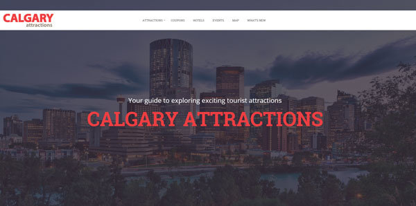
Flat and semi-flat design, large images, clear typography and lots of clean space are popular elements of simple yet striking websites. The Calgary Attractions website is a great example of a simply beautiful design, created with the user in mind.
Hero Images
As mentioned above, big images work well with simple, clean designs and are excellent at telling stories too. Whether it’s a full-screen background image or an image slider spanning the width of the page, a hero image is basically a large banner image placed front and center on a webpage and is the first thing a visitor sees when they land on your site.
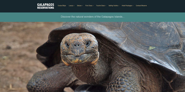
The beautiful centrepiece photos on the Galapagos Reservations website have stolen our hearts!

Hero images should relate directly to the content of your website and should ideally be professional photos of your business rather than stock photography. It’s important to use sharp, high-quality images when photos are displayed so prominently, but don’t forget to optimize image files for fast page-load times and mobile devices.
Video Headers and Backgrounds
The practice of using video (without sound) for page headers and backgrounds has been gaining popularity over the last couple of years as browser technology has advanced and Internet speeds increased. Video is dynamic and engaging and perhaps the very best way to convey an experience — so it makes a lot of sense for lodging and tour operators to adopt this trend on their websites.
When adding a video background or header to a website, it’s important to use a widely-supported video filetype for compatibility with various browsers. And test video backgrounds on mobile devices; if the user experience is degraded, it’s better to automatically substitute the video for a still image on mobile.
A Personal Touch
Have you noticed that modern websites are all starting to look similar? This is in part due to popular patterns and themes emerging from responsive design and content management systems like WordPress. It’s not necessarily a bad thing — in fact, the Google research mentioned above found that people prefer sites with familiar design principles.
However, we do also appreciate uniqueness and creativity. Adding a personal touch to your website — like clever customizations to a WordPress theme, custom-drawn illustrations, or simply professional photos rather than stock photography — adds authenticity and personality to your site and makes you stand out from the crowd.
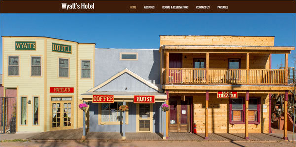
Wyatt’s Hotel takes a simple yet effective approach to showcasing its character through beautiful full-screen photos of the property. And we love their pretty peacock illustration (scroll down on their homepage).

Captivating Animation
Movement is another effective way to engage and captivate viewers (and we’re not talking about garish flash animations or GIFS like the dancing banana).
We’re talking about animation that enhances storytelling and is more interactive.
Scrolling websites lend well to animated scrolling effects. Subtle scroll animations, such as elements and objects that slide or fade into place as the user scrolls down the page, as well as parallax scrolling (where background elements move slower than those in the foreground, creating an illusion of depth and movement) result in a smooth and memorable user experience.
The Inn of the Rockies website is a nice example of subtle scrolling animation, with headings and content blocks that slide in smoothly as the user scrolls down the page, as well as eye-catching hover effects.
Cinemagraphs (photos with moving elements) are becoming trendy too. Created in GIF format (yes, the GIF is actually back, but better than ever), cinemagraphs use less bandwidth than videos and are quite spellbinding. We love how the Island Plantation website uses cinemagraphs to magically transport you to their resort.
Cool Typography
The visual presentation of words is getting more attention with strong fonts, bold statements and the integration of text and images.
Google Fonts makes cool typefaces accessible to all. When choosing fonts and getting creative with text, make sure that typography reflects the style and personality of your business, is easy to read, contrasts adequately with the background, and is consistent throughout your website (don’t use too many different fonts).
The Calgary Attractions website places words on hero images, the bold font matching the style of the website and prairie city perfectly. Using words in this way makes it instantly clear to visitors what the website is all about, and it looks great too.

So there you have it — our rundown of popular Web design techniques as we head into 2016. As with all trends, don’t just follow along because it’s cool; try out the ones you like and that work for your brand and your customers.
You may have noticed that responsive design is not included on the above list. That’s because by now responsive or mobile-friendly website design is more a rule than a trend. If a website isn’t mobile-optimized, it’s simply missing out on a big chunk of business.
Need help getting your website ready for the year ahead? Please don’t hesitate to get in touch.

